Month: April 2025

Add extra value to your art work – part one

No Comments
picture frame


There are several things that you might not have thought of, that add extra value to your artwork and can make it worth more money when you come to sell it. I’m not talking here about reworking pieces you feel haven’t come up to scratch. Yes, it is sometimes possible to rescue a less than perfect watercolour by using a pen and ink technique, and you can paint right over parts of an oil or acrylic painting to in effect completely rework the area, but here I am talking about techniques that don’t involve changing your artwork in any way.

Sometimes you only need to put a cardboard mount around a painting to bring it out of the doldrums, and there is no doubt that the right mount and frame can do wonders for a slightly mediocre piece of art. For a sculpture, or a piece of ceramics, the right stand and appropriate lighting can make a big difference to the way it displays, but after you’ve made sure that your artwork is being displayed to its best what else can you do to add to its worth?

The first and most important thing you should do is make sure that your artwork is signed legibly. It’s surprising how many people forget to sign their art, but it makes a big difference to the buyer. A signed piece of work is worth more money than an unsigned one, and it doesn’t matter whether you sign it on the front, at the top or bottom, within the composition, or even on the back, just as long as you sign it. If you have an illegible signature spare a thought for future generations trying to make out what it says and wondering whether they have a piece by a famous artist. The first thing almost everybody wants to know about any piece of artwork is who made it, what’s the name of the artist. If it’s unsigned it’s almost as though you didn’t rate it enough to put your name to it, and if you don’t rate it no one else will either.

The second thing you need to do, in order to add value to your art, is to give it a title. Now, some people don’t like titling their work because they feel that it pigeonholes it and in some way restricts the viewer to seeing it within a particular set of conceptual boundaries, so if you are one of these people then you should really consider calling it ‘Untitled’. Even with the title that says ‘Untitled’, a piece of work is worth more money than if it doesn’t have a title at all. Artwork without a title leaves the potential buyer wondering whether perhaps it had a title once that has been lost, it leaves the buyer with an unanswered question and means they are less likely to buy it and more likely to move on to another piece instead.

Along with the title, your artwork would benefit from a short explanation about it. The more a buyer knows about a piece of work the more likely they are to buy it. If you think about it by putting yourself in the buyer’s shoes for a moment, if you’re faced with two pieces of work which are similar and you like them both, but you know nothing about one and quite a lot about the other, which one would you buy? Of course you would be much more likely to buy a piece of artwork that had information about it, because you’d feel more involved with it, you’d understand something about its history and about the person that created it, so it has more meaning for you and you feel a connection with it right from the start.

The short explanation or description about your piece of art can say whatever you want it to, there are no rules, but it’s useful to tell people either what it’s about or what it means to you. One thing you don’t want to do is tell people what it should mean to them, the viewer or buyer of your artwork wants to be able to decide for themselves what the piece means to them, and it doesn’t matter if it’s something entirely different from what it means to you.

Most people buying artwork do like to know what it was you meant as you created it, or what drove you to create the piece the way it is. This can mean telling them something about you, your thought processes as you were beginning and working through the piece, or maybe what was going on in your life at the time you were creating this piece of art. You might decide to tell them about something you’d seen or heard that affected you in a particular way and that prompted you to express something specific with this particular medium. You might be telling them that this particular piece of art is one of a collection from your ‘blue period’, or your ‘impressionistic landscape period’, or whatever.

If you don’t really want to give this information away, then perhaps instead you could describe the medium you have used, the particular techniques you’ve employed in using this medium and even the length of time it took you to create the piece. Really any information you give about the piece is better than no information at all, and it doesn’t matter whether the potential buyer understands your concept or not, it still makes it more attractive to them to know that there was an intention of one sort or another behind the original idea.

Categories: Art Tags: Tags: , , ,

Acrylic Painting Lesson – Mistakes To Avoid In Your Acrylic Paintings

No Comments
acrylic painting

When you are just starting out with acrylic painting, you will most certainly make your share of mistakes. This is the natural process of painting and we all learn and grow from our mistakes. This article introduces some of the more common mistakes beginner acrylic painters make.

Mistake #1 to avoid:

Not using enough variety in your painting. An interesting painting has variety. It creates curiosity and interest, and the viewer wants to return again to observe it. So how do you create an interesting painting? Use a variety of different brushstrokes, techniques and values in your paintings. Change the direction of your brushstrokes or mix different techniques in the same painting.

Mistake #2 to avoid:

Being too technical or copying. In order to truly paint a subject, and when I say “truly”, I am not saying you should copy the subject exactly as you see it. I am referring to connecting to the painter inside and truly painting your own impression of what you see. This is how your inner creativity shines on the canvas. It is what set painters like Vincent van Gogh and Claude Monet apart from the rest. They each injected their own style and heart into their work. I believe your own unique creativity comes to the surface the moment you stop relying on the technicalities and theories associated with painting. I am not saying one shouldn’t study techniques and theory, but at some point we have to put that stuff on the back burner and let our creativity do some of the thinking. Whatever you do, don’t copy other artists. There is nothing wrong with allowing other artists to influence you, just make sure you allow your own unique style to come through.

Mistake #3 to avoid:

Not observing your subjects. Do you spend time observing the subjects you feel inspired to paint? If you are a portrait artist, have you done any studying of the human anatomy? If you paint landscapes, do you spend enough time outdoors in that environment? If you aren’t spending enough time observing the subjects that you wish to paint, then you won’t know have enough knowledge to paint them.

Mistake #4:

Not using quality art supplies. Are you using quality acrylic painting supplies? A really experienced and talented artist could probably create an entire painting using a toothpick, but who really wants to work that hard? When it comes to fine art supplies, you usually do get what you pay for. If you paint with a 50cent paintbrush, it will probably paint just like a 50cent paintbrush. The ferrule will more than likely become loose and the hairs will probably shed. If you are using really cheap paint, you will more than likely get really cheap results. The colors will not have the same brilliance or the right consistency. So invest in quality art supplies and take great care of them as well.

Mistake #5 to avoid:

Not using enough paint. Learn how to apply paint to your canvas. Many beginners don’t reload their brushes often enough. I made this same mistake when I first began painting. I would squeeze out a little glob of paint and try to cover as much area as possible. In my case, I was just lazy, but many beginners are fearful of wasting paint. This is a reasonable concern considering the cost of supplies. The truth however, is that your paintings will be more interesting if you lay down the brush stroke, leave it alone, and then reload your brush. Don’t try and scrub the paint into the canvas, otherwise you are just staining, and not painting.

Mistake #6 To Avoid:

Over Thinking. Don’t overly criticize or judge your own work while you are painting. This only creates discouragement and forces many beginners to become frustrated and quit. Just relax and let go. Trust yourself and your abilities.

I hope this article on acrylic painting has been helpful. Never get discouraged if you are making mistakes or not happy with your work. Mistakes are learning tools. Learn and move on. The most important aspect of painting is the enjoyment we receive from it anyway. Frustration and discouragement should never dominate the painting experience. Happy painting!

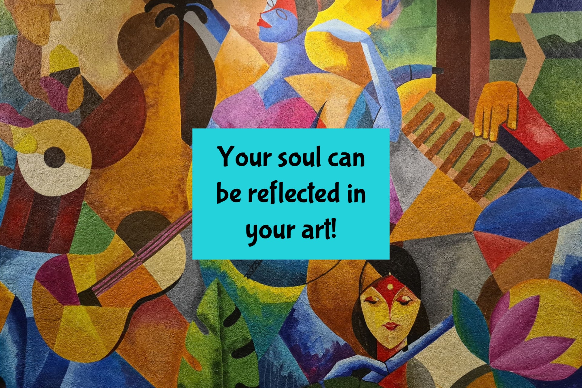
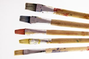
Abstract Art As Therapy

No Comments

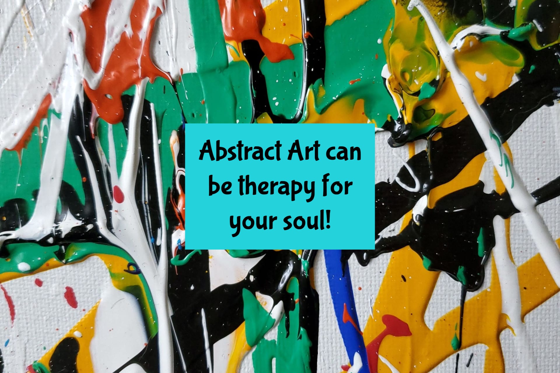
Abstract art is not just a mixture of colourful meaningless patterns and arbitrary shapes.

There is, I believe, a definate therapeutic value to be found in most of the enigmatic marks made by the very different styles available today. What appears to be the most important decision to make is a very careful consideration of the specific audience in conjunction with the choosing of the appropriate artwork. This is not something to be taken lightly or quickly. This can cover anybody within the wide spectrum of individual audiences: a busy boardroom environment or a single office or room where quick thinking, fast reactions, and serious decision making is required; or a worker who returns from a hard days work simply wanting to be visually massaged by an easily observed enigma; or even the space inwhich the desperate and mostly misunderstood person who is gradually loosing their tentative hold on the sense of reality. There is a tremendous variety of possibilities.

Here are some suggested associations from one artists point of view:

Colour plays an obvious healing and therapeutic role to be found in a carefully selected crafted piece, and so colour-field work, which is growing in popularity, first conceived by artists like Mark Rothko and Ellsworth Kelly with their vast areas of empty colour space, might add a general feeling of peace and quiet to an otherwise noisy and hectic environment. With there being very few variations within such a large image a gentle sense of immersion into abstract stillness can slow down any fretful or irratic thinking, and even assist with the adrenal challenge of a creative.

Indefinate shapes or patterns by the likes of Jackson Pollock, Peter Lanyon, and Howard Hodgkin (again, similar works inspired by these very different abstract styles can be seen in many exhibitions, shops and galleries), show a very positive association, and may perhaps persuade a mind filled with illogical thoughts to pause, simply take in the apparent spontenaiety, and then take a different direction. Hodgkin style works in particular can be seen as puzzle like canvases inwhich the observer has no real point of reference so is free to “start” anywhere upon the picture. And because there are very few defined areas sometimes the observer inevitably finds themself either regarding the piece with little emotion, and therefore can freely make a comment – positive or not.

Let us not deny, however, the fact that many an image that has the potential to provoke a negative response can also be of great value to the observer who might actually benefit from seeing such a challenging picture that bears such a bad association. Better there on the wall than here inside the head. In this case the classic associations of red for blood and danger, black for death and sin, brown for decay and illness, along with dramatic lines and movements found in a painting are equally valuable stimulii if revealed within the appropriate environment. This comes back to my point made at the beginning – when choosing a picture, very careful consideration must be taken in order to find that one work of art which speaks directly to the very deepest parts of the observer.

Categories: Abstract, Art Tags: Tags: , ,

Abstract Art And The Spirit 1

No Comments
abstract art


It has been a long and raging arguement that the abstract expressionists of the 50’s, 60’s and 70’s were very busy contemplating their own navels and trying to find the “zen” in everything they did.

I would argue that they were in fact just one very important example of the hungry sleep-drugged soul seeking a way to be heard. However, many artsists of those times, and indeed today, would flatly deny anything remotely to do with spiritual things – or worse still – religious things.

Take, for instance, one of my favourites – Mark Rothko. This tragic artist committed himself to the task of producing massive canvases with many vaguely resembling the outline of a window – especially an after image once the eye has closed. His vast expanses of colour seemed to hunt out a corner or edge in a desperate attempt to complete, or conclude, the picture. Not satisfied with that he went on to give up titling his work saying that he did not want to influence the onlooker in any way. Ironically he failed … and sadly took his own life. For me his works speak of wonderful tantilizing clues visually demonstrating the struggling spirit seeking (and succeeding!) in revealing herself – now that is real influence! Let me explain by an apparently unrelated route:

I seek to assist my own spirit in attempting to make manifest even the tiniest, most pathetic, weakest fact that the spirit in us all is not only just trying to communicate with us – but is in fact actively seeking to set the whole human balance right … which is the spirit leading the mind and body back to her source – not the other way round – the mind and body leading the blinded soul to … well, eventually death.

Not so long ago I came across the writings of Meister Eckhart, a fourteenth century Christian mystic. His words amazed me. He described in his many sermons what he believed to be the truth as to why we are here. He also revealed many tantilizing “images” of the spirit from the least angelic being right up to God Himself. His descriptions were … how can I put it simply? … abstract!

In one of his sermons he described God as … “unknowable” … “not able to be understood” … “undefinable”. In another he made a statement (one of many which may have contributed to him being accused of heresy!) “People say God exists … God does not exist … ” left out of context that would be a truly blasphemous assertion. But he went on to say that “… God is far greater … God is beyond existance”. These and many other controversial sayings have impressed me so much that I have come to “see” God as an abstract entity – not, I hasten to add, an anarchic abstract form – but rather a God far more powerful, far more greater – than I can imagine … in other words totally undefinable. Rather than this putting a distance between me and God, it has done exactly the opposite. And when Eckhart began to describe the life of Christ in an almost completely abstract way – Eckhart said that Christs life was the greatest example of the seeking and finding the uncreated source of the pure soul – my imagination began to run like a film of frenzied obscure visuals. Eckhart has become, to me, the patron saint of abstract artists.

The beauty of Eckharts enigmatic words are intensely inspiring. What better way to illustrate his poetic writings than to describe Gods “isness” in the very basic form of a gigantic flat area of one saturated colour untainted by anythingelse. Strangely enough this could be part of an exact description from one of Rothko’s immense, sometimes almost monochromatic, paintings.

But this is by no means the whole story … one of Eckhart’s contradictions said that on the one hand God is totally unapproachable, yet at the same time God is actually very, very approachable …

However, that is another article.

Categories: Abstract, Art Tags: Tags: , , ,

Abstract Art and I

No Comments
abstract art

I have always loved bright colors and movement, like dancing its healing, relaxing fulfilling and challenging as well. The bottom line is the feeling and message that I want to convey through the medium. When I paint, every attempt is to capture the feel of warmth, passion, joy and bliss in none objective or figurative composition. I enjoy experimentation of different media and subjects.

My subject varies based on my emotion and statement but my love for colors is constant. In spite of this, viewers see different forms or figures in my abstract expressions. The good thing about these expressions is the freedom of the viewers to see and appreciate the forms in their mind’s eyes, like face painting in the eye of the viewer. Its also important to mention that “Uli” which is my traditional art style has played a major role in my age long career. The symbols and forms of this art style are reflected in my cubism, abstract images, abstract relief sculpture, seascape, drawing, pastels and watercolor painting.

People see different forms or images in abstract art, the depth of what you actually see when you look at the paintings is partly based on individual exposure and understanding of art forms, color, shapes, line and texture; which are the physical elements that combine to make up the artworks.

A selection of different dark hues, shapes and forms may give various impressions to different minds; light, airy images as mystical; balanced, temperate forms as peaceful. Uli organic forms and shape are symbolical such as colors and forms have meaning in and of themselves. It is a simple truth that you can’t give what you don’t have. I am a believer and my work time is also a meditation time, which can go either way depending on the spiritual consciousness of the creative mind.

To me, my work section is an intimate moment between I, canvas and colors. At this creative moment there is a spiritual impartation from the artist to the Art. Hence the emotional reaction to these elements even if they create no recognizable object for us to hang onto.

I enjoy the inclusion and deletion of space. The handling of space or the illusion of space is another powerful element in the artist’s mind. If you are drawn into a yard of three-dimensional space stretching beyond the framework of the painting to sculpture, you are not alone. The impression of depth, perspective, airiness, solidity, textures and other spatial relations are created and controlled to achieve a desired goal.
The overall composition or design of my painting or sculpture is created to guide the viewer’s eyes to understanding and appreciation of the images.

I must admit, most of my figurative compositions is a celebration of womanhood, which I am very proud to be part of for they are the seats of wisdom and knowledge.

I pride in the feeling and reactions of my clients and viewers to my creations. I feel blessed in many ways than words can express. The challenge sometimes is getting the composition right, or balancing the elements of color, lines and shapes while maintaining a dynamic tension and massage beneath.

Energy is the life force that is present in all good art. This is not something that is easily defined. The life force of every work I do is the same, but different energy and different statements. It is this peculiar energy that makes my works speak to you, and makes them unique, original and identifiable to me. This energy is created out of experience and self-awareness, materials and tools, but the end is more than the means in the same sense that a musical composition is so much more than a collection of notes.

You are welcome into my world of abstract wall art or modern art, relax and let your eye leisurely wander over the collection of verities of art forms and styles. Let your heart and mind react to my colors, shapes, figures and textures. Come and spoil yourself a little in the illusion of vibrant spaces, the movement of lines and the mood of blissful atmosphere.
Come, come up close and explore the intricacies of brushstrokes, spatula- strokes, paint thickness, textures and compositional details. Enjoy how the parts are woven together to form the whole.

Take your time. My artwork cannot be understood and appreciated in a ten second glance. Allow my art to grow on you, becoming more interesting and more enjoyable to look at as you live with it.

A Quickie Art Primer

No Comments
Prints coming out of a printing machine

Most collectors understand and feel knowledgeable when speaking of singular original works of art ? paintings, pencil drawings, pen and inks, acrylics, watercolors, etc. Here the artist has created one work of art with his own hand. The surface might be paper or canvas or even masonite.

A bit more complicated are Multiple Originals…commonly called Original Prints. Traditionally, the artist creates a master image for the purpose of making a small number of prints that he will sign and number. The master image might be created upon a block, stone, plate or screen ? any of which assists in conveying the image to the print surface. See our chart detailing the differences in woodcuts, etchings, lithographs, and serigraphs or silkscreens.

The blocks, plates, stones and screens cannot be considered originals. They are just vehicles to produce Original Prints.

Next there are Reproductive Prints. The artist has produced an original work…and photograph technology and automated printing equipment create reproductions. Fine art print reproductions are usually signed and numbered in limited editions and care must be exercised so they remain in mint condition in order to preserve their value. Click the link above the view a diagram.

A similar, but much advanced process, creates gicl?es ? the state of the art prints now taking the art collecting world to a whole new level.

Categories: Art Tags: Tags: , ,

A Look At The Crystal Bridges Museum of Art

No Comments

Some critics might say Jasper Cropseys The Backwoods of America, part of the Crystal Bridges growing American Art Collection, is a symbolic icon for billionaire Alice Waltons passion for the arts.

Designed by world renowned architect Moshe Safdie, and funded by billionaire Alice Walton, the 50 million dollars that is just the cost of the facility and does not include the artworks Crystal Bridges Museum of American Art isĀ  openĀ  in Bentonville, Arkansas. The daughter of Sam Walton, Founder of Wal-Mart, made the controversial announcement.

The museum will house a permanent collection of signature works from American artists along with galleries dedicated to regional art and artists including Native American art, but oddly enough, this monumental task is not making everyone happy.

The depth of the museum is indicated in a purchase from Christies Americas auction house in New York City in 2004 of Charles Wilson Peales portrait of George Washington for $6.1 million. This is causing some critics to puff up, believing that the art works are being snatched from their own backyard. No need to worry, collaborating with other institutions will be an important focus of Crystal Bridges, even before the museum opens, and they can also rest easy to know Bentonville does have an airport.

A number of the works from the Crystal Bridges permanent collection are already on loan at various museums throughout the United States including: The Hudson River School masterwork Kindred Spirits which was loaned to The National Gallery in Washington, D.C. for public viewing from 2005 – 2007. It is currently on loan to the Brooklyn Museums exhibition by the same name featuring the works of Asher B. Durand. The same exhibition will also travel to Washington D.C. and San Diego.

Thomas Eakins Portrait of Professor Benjamin H. Rand is currently on loan to the Philadelphia Museum of Art. Jasper Cropseys majestic depiction of early American frontier life, The Backwoods of America, is now featured in the American galleries of The Nelson-Atkins in Kansas City, and the most extensive surviving group of Colonial American portraiture, the Levy-Franks family paintings, is currently on loan at The Jewish Museum in New York City. Also, the distinctive painting George Washington (The Constable-Hamilton Portrait) by the American painter Gilbert Stuart is currently on view at the Museum of Fine Arts Houston.

While the puffers puff, others admire Waltons passion and dedication to the arts, and recognize the fact Crystal Bridges will be the premier American Art Collection, once it is in place. The collection is headed up by Bob Workman, formerly associated with the Amon Carter Museum in Fort Worth, Texas.

When completed, the museum complex will encompass approximately 100,000 square feet of gallery, library, meeting, and office space, a 250-seat indoor auditorium, areas for outdoor concerts and public events, gallery rooms suitable for large receptions, as well as sculpture gardens and walking trails. Walton is building this American Dream on 100 pristine, wooded acres her family owns in Bentonville.

Categories: Art Tags: Tags: , , ,

7 Ways To Ensure Your Artwork Is Print Ready

No Comments
brushes

brushes

Brushes

The following article provides a quick guide on what to think about when preparing your artwork for printing.

It is important you follow these guidlines as any errors made are likely to cause a delay or cause unncessary stress should the final print quality be sub-standard.

1. Check your files
Check your artwork for spelling mistakes, grammar and ensure all images used are high resolution. Double check to make sure as any errors found will delay the turnaround of your product.

2. Bleed
Bleed is the extra bit of the design page which you design on, as normal, with the knowledge that it will be trimmed off the finished flyer. Any images on your artwork should bleed off the page, and essential text should be away from the trim edge by a good few mm's. We use a 2mm bleed area on each edge.

3. Text
Keep essential text away from the edge of the flyer, by about 8-10mm for best results.

4. Print Resolution
Ensure your artworks resolution is at least 300dpi. The higher the resolution the better.

5. File Formats
If you are using un-common fonts, ensure you supply your artwork as a flattened jpeg or tiff. This will ensure there will be no font problems when your artwork is checked. The most commonly accepted program formats are Quark, Illustrator, Photoshop, Corel Draw, Corel Paint, Freehand, InDesign and Paint Shop Pro. Vector files such as .eps and pdf's are becoming more common and ensure a better end product.

6. Colours
Unless you have a calibrated monitor your artwork is likely to have slightly different colours when printed. Ensure your colour choices are correct before sending to print.

7. A Final Check
Before sending to your printer, have one more final check that everything is as expected.